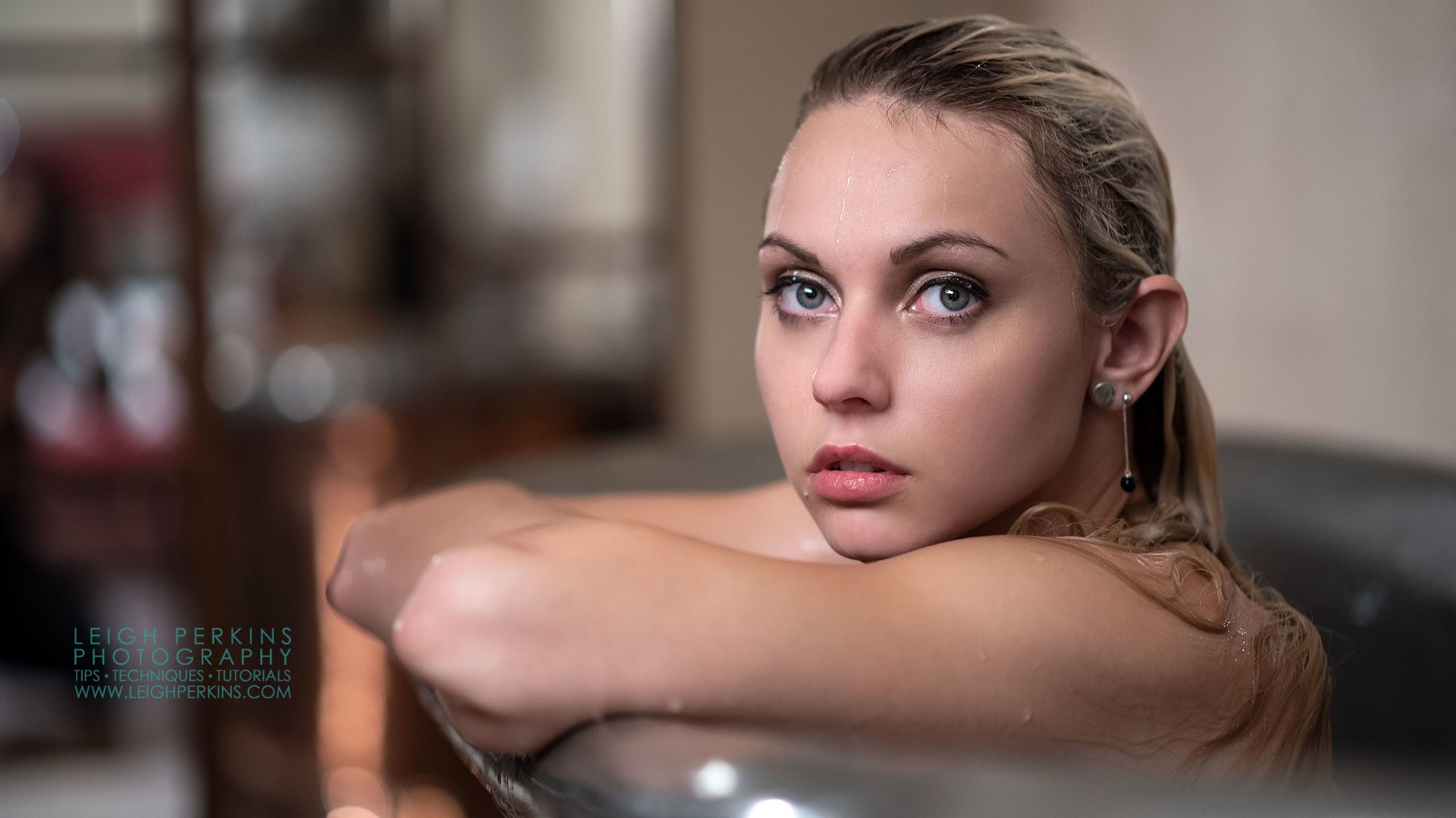
Red Lights and Rotten Eggs
Black and white images have been with us quite literally since the birth of photography or more accurately “mono” images have. Over the years our love for mono has taken us through many trials and experimentations. In days gone by I can remember spending many a sulphur-rich session in the darkroom trying to decide which variant of sepia tone I preferred. Enduring the stench of rotten eggs in pursuit of perfection, those were definitely simpler times.
Photoshop gives us several options for creating black and white conversions of our colour original and when it comes to colour toning we literally have millions of options to choose from. For the indecisive amongst us, this can cause hours of procrastination and agonising decision making before settling on a favourite.
Mixing the Channels
Ever since around PS4 I decided that my preferred method of creating a black and white image was to use the “channel mixer” method. It dispenses with the automation of “convert to greyscale” and leaves me in complete control as to the way each of the three primary colours is treated during the conversion. This ensures I’m completely in charge when it comes to deciding on the levels of contrast required.
I’ll be quite honest here and say that for the majority of my conversions, once I’m in the channel mixer. I use the same settings red:50% blue:25% green:25%. “Why?” I hear you ask. Well firstly the vast majority of my “paid for” work involves skin. Models and clients in lingerie, nudes, physique imagery all mean there is more skin on show in each image that anything else. The 50% in the red channel and the others at 25% gives me a nice pleasing contrast without going overboard which may start to exaggerate
blemishes, veins and the like. Secondly, I’m a bit lazy and it does seem to be a good “fit for most” solution!
Each to Their Own
Each and every person will not only have their own preferred numbers here and it will depend on a wide and varied number of factors way too long to discuss here and I’m certainly not here to argue the toss on that score. Simply to say that this is my preferred method for giving control, flexibility and speed when converting my colour images into something a bit more mono.
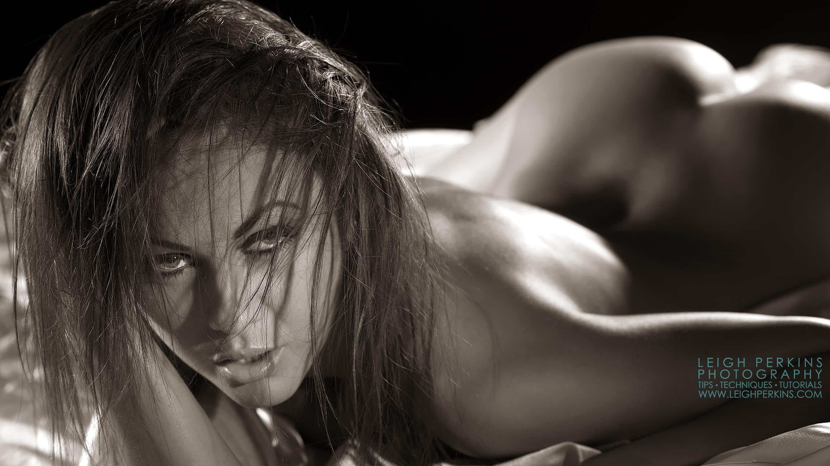
[caption id="attachment_146" align="alignleft" width="400"]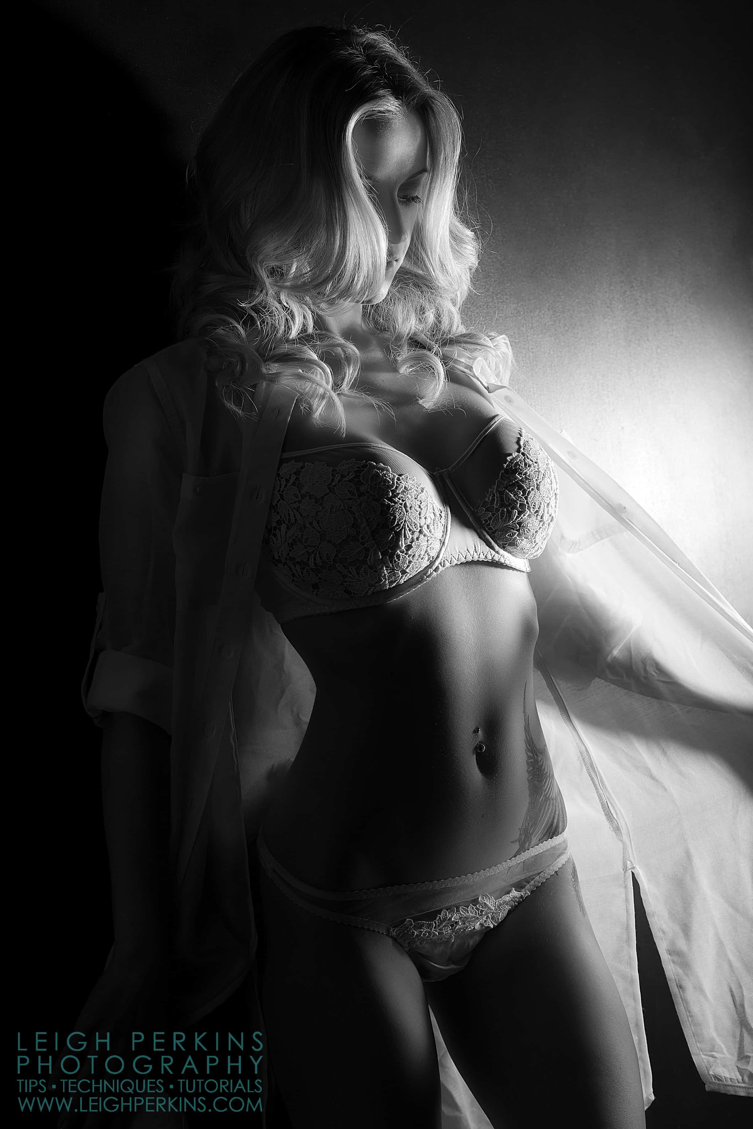 The BW version of this image whilst still great is less inviting than the toned version.[/caption]
[caption id="attachment_145" align="alignleft" width="400"]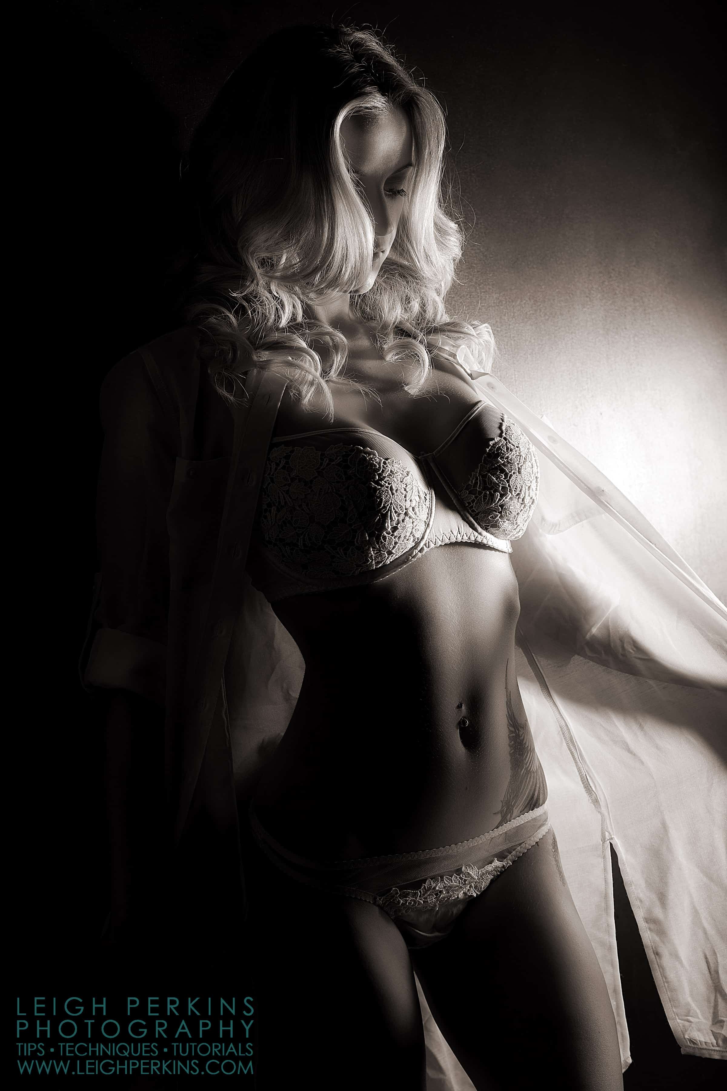 The toned image has more warmth and richness than the original bw.[/caption]
So without further ado, Ladies and gentlemen I give you Leigh’s quick guide to black and white conversion and colour toning.
The BW version of this image whilst still great is less inviting than the toned version. The toned image has more warmth and richness than the original bw.